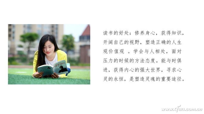
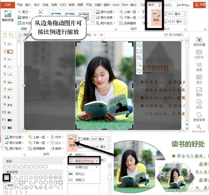
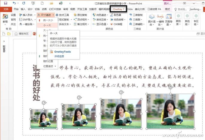
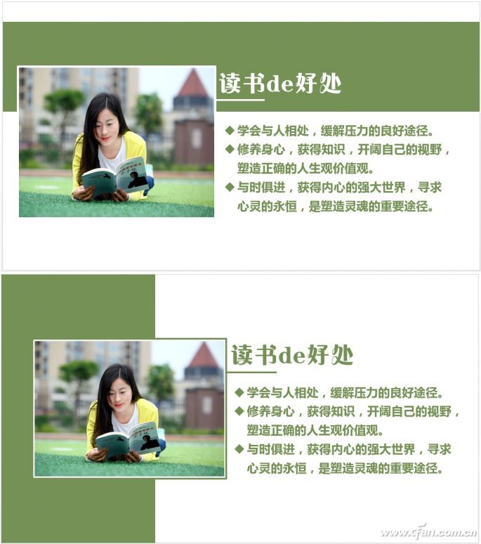
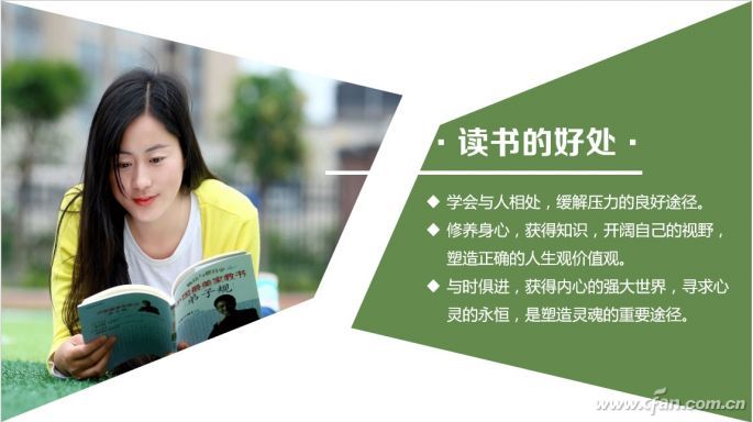
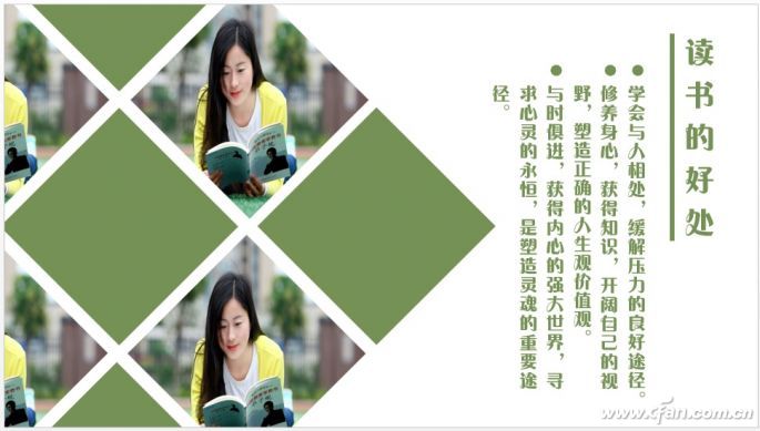
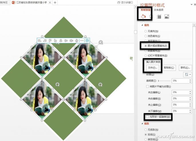
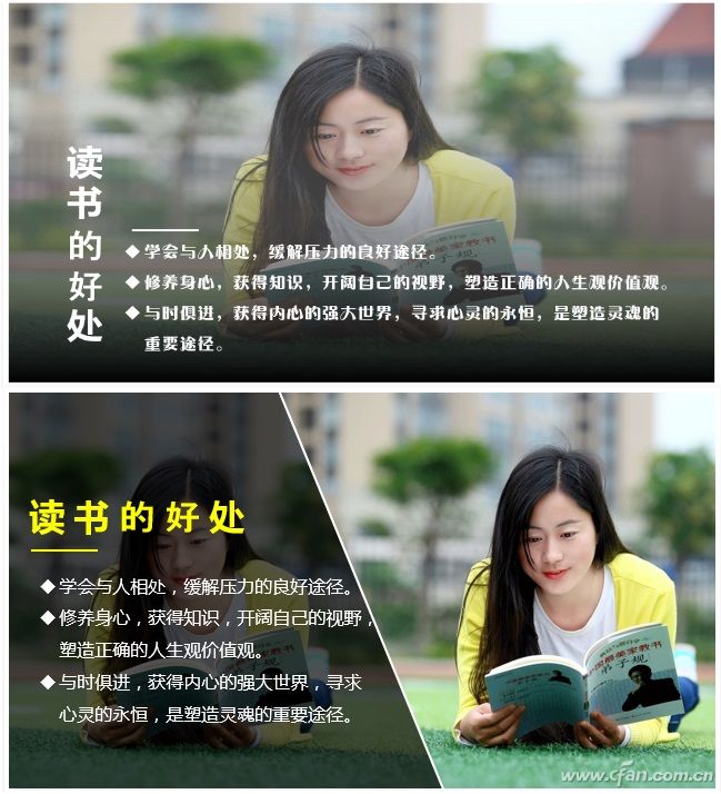
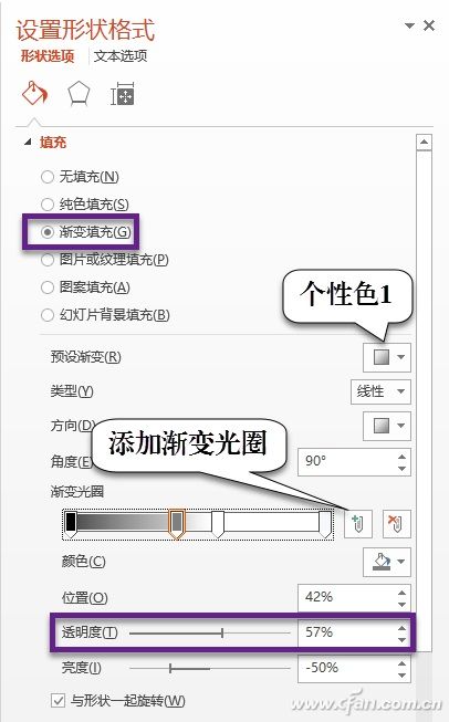
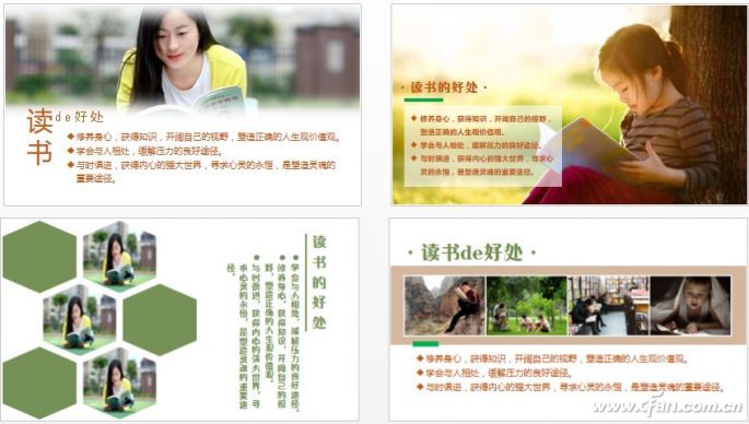
Creating a professional-looking PowerPoint presentation doesn't require advanced design skills. For most people who aren't graphic designers, learning through imitation is one of the best ways to improve. This article will explore various layout designs, helping you understand and master common techniques in a straightforward way. The following is the original typography style of this passage (Figure 1). We'll apply different typesetting methods to it, and through layout comparisons and hands-on practice, you'll be able to appreciate the magic of layout design and use these techniques effectively in your own work. Modify the Style Often, all you need to do is make simple adjustments to the visual elements in your slides. These changes can involve adjusting picture size, border proportions, or using repeated shapes. Text styles can be modified by changing fonts, colors, or paragraph settings. Adding small decorative lines or graphics can also enhance the overall layout. These subtle touches can dramatically transform how your slide looks and feels. Let's look at an example (Figure 2). Start by extracting the title "The Benefits of Reading" from the paragraph. Select that text and drag it out to separate it. Then press Enter to divide the remaining content into three parts. Go to the "Home" tab, click the "Bullets" option under "Paragraph" to organize the text better, and finally add a horizontal line under the word "Reading." Select the image and drag its corner to match the height of the layout. Switch to the "Format" tab, click the "Crop" button to keep only the main part of the image (Figure 3). If you don’t want the image to stand out too much, you can crop it into an ellipse. You can also crop the image into other shapes and add a dashed line below as a decorative element. As shown in Figure 4, set the "Text Direction" of the title to "Vertical." Select the image and press Ctrl+D to copy and paste three more. Adjust the size of the four images so they increase gradually. With the Onekey7 tool (http://oktools.xyz), you can automatically scale images proportionally. After installing the tool, adjust the first two images, then select all four, go to the "Onekey 7" tab, choose "Small -> Large" under "Size Advance" to scale them evenly. Clever Use of Color Blocks When there are many irregular elements on a slide, using regular color blocks—whether square, round, or irregular—can help create a sense of order and unity. Both layouts use horizontal or vertical color patches. The color of these patches can be taken directly from the image. Use the color picker to choose the right shade (Figure 5). In the top layout, the image border is set to white, and the title is also white. The white decorative lines below connect with the image frame to form a cohesive visual. The text color matches the color blocks. The bottom layout uses similar lines for the borders, and the text color also aligns with the color blocks. Both designs feel harmonious and reflect a modern flat design trend. As shown in Figure 6, the image is cropped in an irregular shape, and the same shape is used for the color block on the other side, creating a more unified look. Draw a rectangle matching the layout height, switch to the "Format" tab, select "Edit Shape," and drag the vertices to change the shape. Copy and paste the graphic to repeat it. Switch to the "Format" tab, select "Vertical Flip" or "Horizontal Flip" to align the two graphics. Place one graphic over the image, hold down Ctrl, select the image first, then the graphic. Go to the "Format" tab, choose "Intersection" under "Merge Shapes" (Figure 7). This will cut the image into the desired shape. Add text to the color block and draw a line across the image and graphic to make them look more integrated. Using repeating color blocks and images is a common technique in layout design (Figure 8). When there are an odd number of images, draw a white square with green edges, rotate it 45 degrees, copy it eight times, and arrange them in a 3x3 grid to form a rotated square pattern. Select part of the color blocks (Figure 9), right-click, and choose "Set Shape Format." Under "Shape Options," select "Picture or Texture Fill," then click "File" to choose the corresponding image. Deselect "Rotate with Shape," select all the color blocks and images, press Ctrl+X to cut them, and then right-click to paste them under "Pictures" to convert the blocks into an image. Finally, trim the image and remove any excess parts. Use Masks Masks are widely used in PowerPoint design. Usually, a semi-transparent graphic is placed over an image to reduce its impact on readability. This masking effect makes your PPT look cleaner and more professional. As shown in Figure 10, the top layout uses a full mask to highlight the text, while the bottom layout uses a half mask to balance the text and image (Figure 10). The Mongolian version involves a transparent graphic overlaid on the image. Draw a rectangle that covers the image, then adjust its properties. Under "Shape Options," select "Gradient Fill" (Figure 11). Choose a preset gradient, add black and white apertures in the "Gradient Stops" to adjust transparency. Make the top part of the mask clear and the bottom as dark as possible. Finally, add white text on top. Sometimes, text is added to a full-color background, which is a common technique. The lower image in Figure 11 uses a trapezoidal mask, with pure black as the base and adjustable transparency. Of course, layout changes go beyond what’s shown here. They are designed based on the actual content, text, and audience (Figure 12). In general, layout design is all about transformation—expressing the object in new and creative ways. Double Pole Rocker Switches,2 Pole Rocker Switch,Dual Pole Rocker Switch Yang Guang Auli Electronic Appliances Co., Ltd. , https://www.ygpowerstrips.com